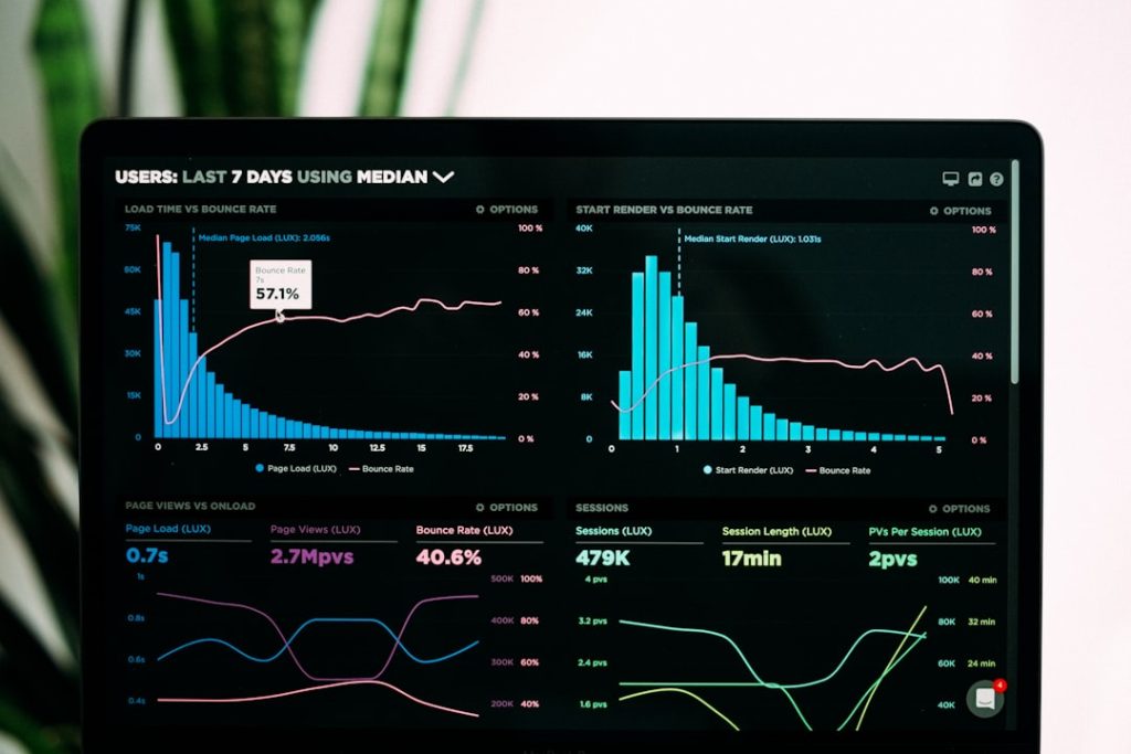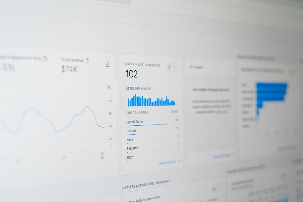

Customer churn is rarely caused by a single event. More often, it is the result of declining engagement, unmet expectations, weak onboarding, poor timing, or unnoticed changes in customer behavior. Churned.io is designed to help subscription businesses, SaaS companies, and customer success teams identify these patterns earlier through customer churn analytics, dashboards, and clear data visualization.
TLDR: Churned.io helps teams understand which customers are likely to leave, why churn risk is increasing, and what actions may reduce revenue loss. For example, if a SaaS company with 10,000 users sees that accounts with a 40% drop in weekly logins are twice as likely to cancel, Churned.io can help surface that signal before the cancellation happens. Its dashboards make churn trends, at-risk segments, retention drivers, and customer health metrics easier to monitor and act on. The platform is especially useful for teams that want churn insights without relying only on spreadsheets or delayed reporting.
Why Customer Churn Analytics Matter
Churn analytics is the process of using customer data to understand and predict customer loss. In a subscription-based business, churn directly affects recurring revenue, growth forecasts, acquisition efficiency, and customer lifetime value. A business may continue acquiring new customers, but if too many existing customers leave, growth becomes expensive and unstable.
Churned.io focuses on turning customer behavior into practical insight. Instead of looking only at cancellations after they happen, teams can monitor leading indicators such as usage decline, reduced feature adoption, billing issues, support complaints, inactivity, or changes in account engagement. These indicators help businesses move from reactive reporting to proactive retention management.
Core Feature: Customer Churn Analytics
At the center of Churned.io is its ability to analyze customer data and highlight churn risk. This may include product usage data, account history, subscription details, customer attributes, and engagement behavior. By combining these signals, the platform helps teams understand which customers are healthy, which customers are drifting away, and which groups need attention.
Useful churn analytics typically answers several important business questions:
- Who is most likely to churn? Teams can identify customers, accounts, or segments showing elevated risk.
- Why are they at risk? Analytics can point to patterns such as low usage, missing onboarding milestones, lack of feature adoption, or repeated support issues.
- When is intervention needed? Early signals allow customer success and account management teams to act before renewal or cancellation decisions are final.
- Which segments retain best? Businesses can compare cohorts by industry, plan type, company size, region, acquisition channel, or product behavior.
This type of analysis is valuable because it creates a more disciplined retention strategy. Instead of relying on assumptions, teams can prioritize customers based on evidence. For example, a customer success manager may discover that users who have not activated a key feature within the first 14 days are significantly more likely to churn within 90 days. That insight can lead to changes in onboarding, education, messaging, and product design.
Predictive Churn Signals and Customer Health
One of the most important uses of churn analytics is building a reliable view of customer health. Churned.io can help translate multiple data points into an understandable risk profile. A customer might have strong billing history but declining product engagement. Another might use the product frequently but generate repeated support tickets. A basic report may miss these differences, while a health-focused analytics model can bring them into context.
Customer health scoring is especially useful for prioritization. Sales, success, and support teams often have limited time, so they need to know where attention will have the highest impact. A structured churn risk view allows teams to separate urgent cases from normal fluctuations.
For example, if 18% of enterprise accounts show a declining health score over a 30-day period, management can review whether the issue is related to onboarding, product performance, pricing concerns, or a change in customer needs. This turns churn prevention into an operational process, not just a quarterly discussion.
Dashboards for Clear Decision-Making
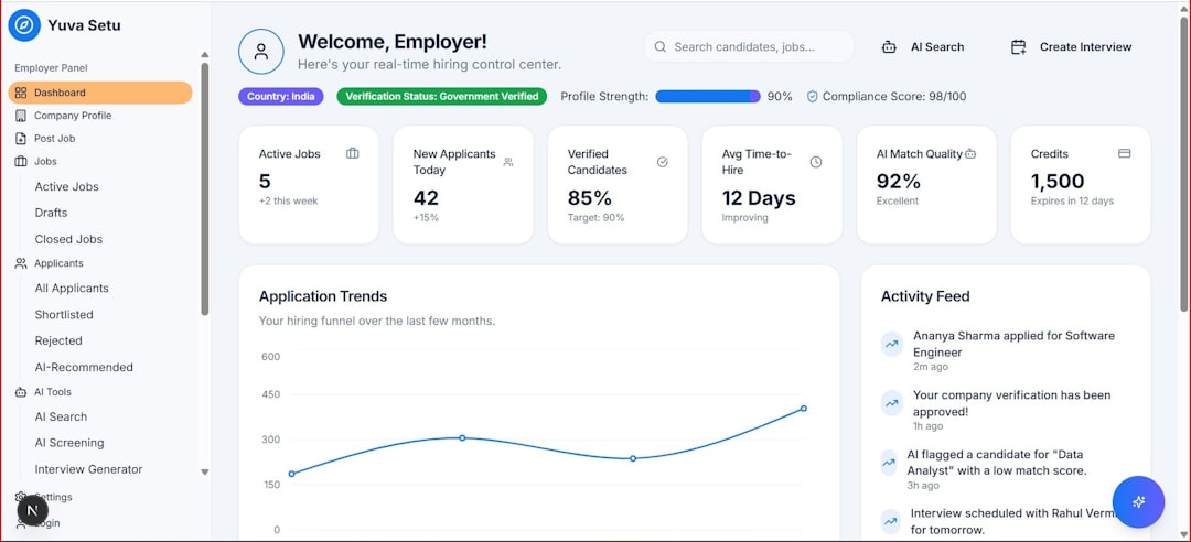
Dashboards are one of the most practical features of Churned.io because they make complex customer data easier to monitor. A well-designed churn dashboard should provide executives with a high-level overview while still allowing customer-facing teams to examine specific accounts and segments.
Churned.io dashboards may include views such as:
- Overall churn rate: A clear view of customer churn and revenue churn over time.
- At-risk customers: A prioritized list of accounts that may need intervention.
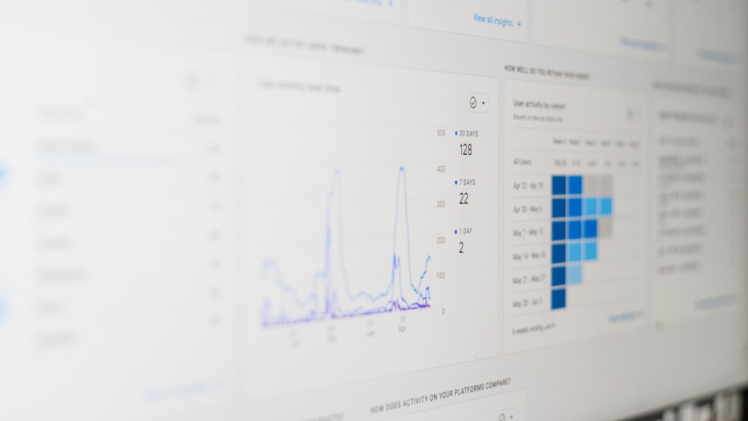
- Retention cohorts: Groups of customers tracked by signup date, plan, industry, or other shared characteristics.
- Revenue impact: Visibility into how churn risk affects monthly recurring revenue and annual recurring revenue.
- Customer health trends: Changes in engagement, usage, satisfaction, and support activity.
- Segment comparisons: Performance differences across customer groups, markets, or acquisition sources.
The value of these dashboards is not only visual convenience. They also create alignment. Executives, product managers, marketing teams, and customer success leaders can work from the same information. When everyone sees the same churn signals, it becomes easier to agree on priorities and measure results.
Data Visualization That Makes Churn Easier to Understand
Churn data can be difficult to interpret when it is spread across spreadsheets, CRM records, billing systems, and product analytics tools. Data visualization helps make patterns visible. Instead of reviewing raw exports, teams can see trends, outliers, and changes through charts, graphs, tables, and customer timelines.
Effective visualization supports faster decisions. A line chart may show whether churn is improving or worsening month by month. A cohort chart may reveal that customers acquired through one campaign retain better than those acquired through another. A usage heatmap may show that inactive accounts tend to churn after a predictable period of declining engagement.
Visual context is also important for communication. When customer success teams present churn risks to leadership, visual reports are often more persuasive than isolated numbers. They show not only what is happening but also how trends develop over time.
From Insight to Action
The purpose of churn analytics is not simply to produce reports. The goal is to improve retention. Churned.io can support this by helping teams move from identification to action. Once risky customers or weak segments are visible, businesses can create targeted retention initiatives.
Examples of practical actions include:
- Sending onboarding guidance to users who have not completed key setup steps.
- Triggering customer success outreach when engagement drops below a defined threshold.
- Offering training to accounts with low adoption of high-value features.
- Reviewing pricing or packaging for segments with elevated cancellation rates.
- Improving product workflows where usage data shows repeated friction.
These actions become stronger when measured. If a company introduces a retention campaign for at-risk accounts, Churned.io dashboards can help track whether churn risk decreases, engagement improves, or renewal rates increase. This feedback loop is essential for building a mature retention strategy.
Supporting Different Teams Across the Business
Churn is not only a customer success issue. It affects multiple departments, and Churned.io’s analytics and visualization features can support each of them in different ways.
- Executives can monitor churn trends, revenue exposure, and long-term retention performance.
- Customer success teams can prioritize outreach and manage customer health more effectively.
- Product teams can identify features that correlate with retention or abandonment.
- Marketing teams can evaluate which customer sources produce better long-term value.
- Sales teams can understand which customer profiles are more likely to become durable accounts.
This shared visibility helps businesses treat churn as a company-wide metric. When retention data is accessible and understandable, teams can collaborate more effectively on improvements.

What Makes Churned.io Valuable
The main value of Churned.io lies in its ability to make churn more visible, measurable, and manageable. Many companies already have the data they need, but it is often fragmented or difficult to interpret. Churned.io helps bring that information together into a more useful format.
Reliable churn analytics, clear dashboards, and thoughtful data visualization can change how a business approaches retention. Instead of waiting for cancellations, teams can identify risk earlier, understand behavioral patterns, and take focused action. Over time, this can contribute to stronger customer relationships, more predictable recurring revenue, and better strategic planning.
For businesses that depend on renewals, subscriptions, or long-term customer engagement, churn visibility is not optional. It is a practical requirement. Churned.io provides tools that help teams understand churn with greater clarity and respond with greater confidence.