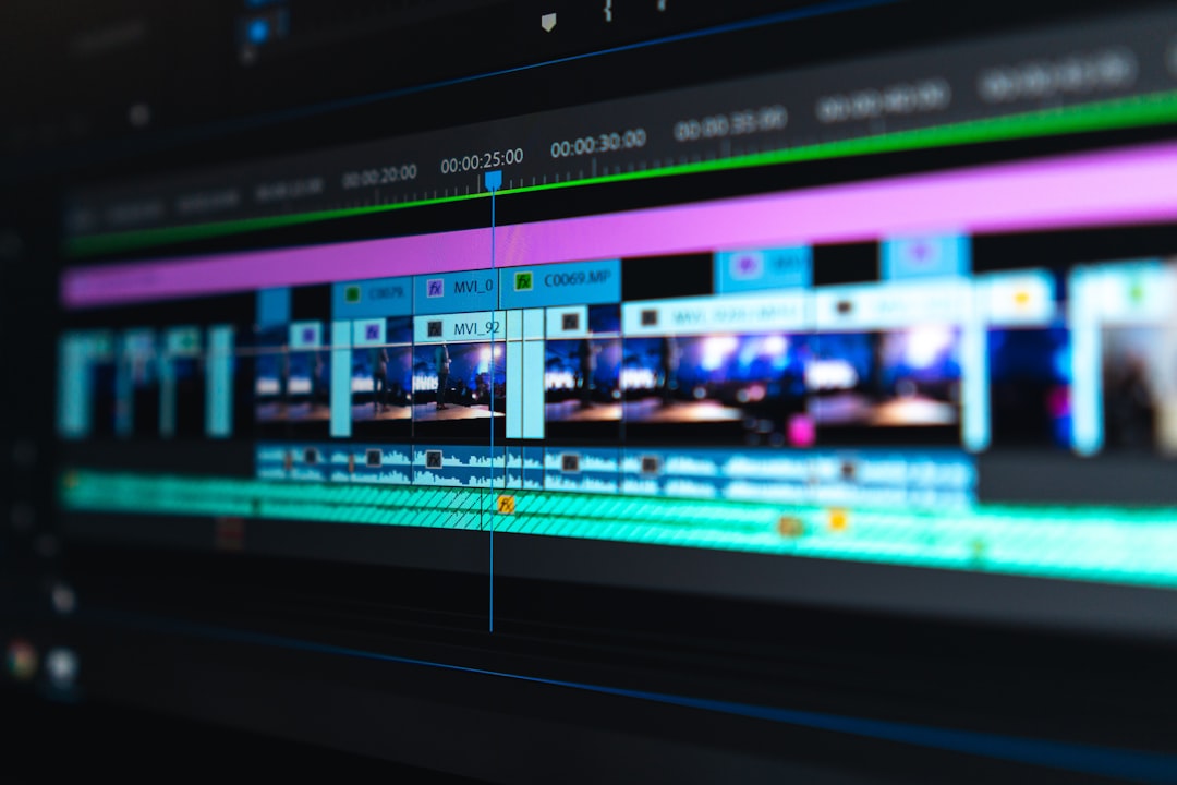

Color correction is the process of making video footage look natural, consistent, and technically clean before any creative styling begins. It fixes problems with exposure, white balance, contrast, saturation, and skin tones so every shot feels like it belongs in the same scene. If one camera angle looks blue, another looks orange, and a close-up is too dark, color correction is what brings them into line.
TLDR: Color correction makes footage accurate and consistent, while color grading gives it a creative mood. For example, a wedding editor may correct 300 clips from three cameras so the bride’s dress stays white, skin looks natural, and the ceremony does not shift from warm to green between angles. In a small editing job, proper correction can cut revision time by 30% to 50% because clients stop asking why one shot “looks weird.”
What Color Correction Really Means
Color correction is not about making footage cinematic right away. That comes later. First, the editor cleans up the image so it represents the scene properly.
A well-corrected shot should have:
- Balanced brightness with detail in shadows and highlights.
- Neutral whites without unwanted blue, green, or orange casts.
- Controlled contrast that gives shape without crushing detail.
- Natural skin tones that do not look gray, red, yellow, or plastic.
- Shot-to-shot consistency across a full scene or sequence.
Think of color correction as cleaning the canvas. Color grading is painting on it. Both matter, but mixing them too early can create a mess that takes ages to fix.
Exposure: Getting Brightness Under Control
Exposure controls how bright or dark a shot appears. Bad exposure is one of the most common video problems. A face may be buried in shadow. A window may be blown out. A product may lose texture because the highlights are too strong.
Editors usually adjust exposure using tools such as lift, gamma, gain, offset, curves, or simple brightness controls. Scopes help here. The waveform monitor shows how bright the image is from black to white. It is much more reliable than guessing by eye, especially if your monitor is not perfectly calibrated.
The goal is not always to make every shot bright. A night scene should still feel like night. A moody interview can stay soft and dark. The goal is to keep detail where it matters and make sure the viewer can read the subject.
Honestly, it feels like half of beginner correction is just undoing exposure choices made under bad lighting. A shot that was five seconds from being usable on set can take five minutes per clip to repair in post. That adds up fast.
White Balance: Fixing Color Temperature
White balance decides what the camera treats as neutral white. When it is wrong, the whole image shifts. Indoor bulbs may turn skin orange. Shade may make a shot look icy blue. Fluorescent lights can push everything toward green.
Color correction fixes this by adjusting temperature and tint:
- Temperature moves the image between blue and orange.
- Tint moves the image between green and magenta.
A simple trick is to find something in the frame that should be neutral, such as a white shirt, gray wall, paper, or product label. Then adjust until it looks clean. Scopes can help, but skin and memory colors matter too. People know what skin, grass, snow, and sky should feel like. If those are off, viewers notice, even if they cannot explain why.
Contrast: Shape, Depth, and Detail
Contrast is the difference between light and dark areas of an image. Low contrast can look flat and foggy. High contrast can look bold, but it can also destroy detail if pushed too far.
A balanced contrast correction adds depth while keeping texture. Blacks should feel rich, not like a hole. Whites should feel bright, not clipped. Midtones should carry the subject, especially faces.
Curves are one of the best tools for this. A gentle S-curve can add punch by lowering shadows slightly and raising highlights slightly. But go too far and the footage starts to scream “preset.” It drives me crazy when a simple interview gets crushed until the speaker’s jacket becomes a black blob with no detail. Strong is not always better.
Skin Tones: The Viewer’s Built-In Quality Check
Skin tones are where color correction gets serious. Viewers forgive a lot, but strange skin color feels wrong right away. Faces are usually the emotional center of a shot, so they need careful handling.
Good skin tone correction depends on exposure, white balance, and saturation working together. If the face is too dark, color may look muddy. If white balance is green, skin can look sick. If saturation is too high, faces can turn sunburned or waxy.
Many editors use a vectorscope to check skin tone. Most human skin, across many complexions, tends to fall near the same general skin tone line on the scope. That does not mean all skin should look the same. It means hue relationships are predictable. The editor still needs judgment, respect, and restraint.
Useful skin tone checks include:
- Does the face match the lighting in the scene?
- Do shadows still contain natural color?
- Are cheeks, lips, and forehead too red or too yellow?
- Does the person look healthy and real?
Color Correction vs. Color Grading
Color correction and color grading are often confused, but they serve different jobs.
Color correction fixes the image. It makes shots accurate, balanced, and consistent.
Color grading creates the look. It may add teal shadows, warm highlights, faded blacks, film-style contrast, or a cooler commercial feel.
For example, a travel vlog shot at noon, sunset, and indoors needs correction first. The editor matches brightness and white balance so the episode feels steady. After that, grading can add a warm golden tone to support the story. If grading comes first, every later repair becomes harder.
A Professional Color Workflow
A professional workflow keeps the process clean. It also saves time when clients request changes.
- Organize the footage. Group clips by camera, scene, lighting setup, or location.
- Normalize the image. Convert log or flat footage into a standard working contrast and color space.
- Correct exposure. Set black points, highlights, and midtones.
- Fix white balance. Remove unwanted color casts.
- Match shots. Make angles in the same scene look consistent.
- Refine skin tones. Use masks or qualifiers only when needed.
- Apply creative grade. Add style after the base image is stable.
- Check delivery. Review on scopes and, when possible, more than one screen.
Why Scopes Beat Guesswork
Your eyes adapt. That is useful in real life, but risky in editing. After staring at warm footage for ten minutes, it may start to look normal. Then you export, watch it later, and the whole scene looks orange.
Scopes give objective feedback. Common tools include:
- Waveform: checks exposure and brightness levels.
- RGB parade: compares red, green, and blue channels.
- Vectorscope: checks hue and saturation, including skin direction.
- Histogram: gives a quick view of tonal distribution.
You do not need to become a color scientist to use them. Start with the waveform and vectorscope. Those two alone can catch many common mistakes.
Common Color Correction Mistakes
Many bad corrections come from doing too much. The footage may need a small exposure lift and a tiny tint shift, not ten stacked effects.
Watch out for these problems:
- Over-saturation: colors look fake and skin becomes harsh.
- Crushed blacks: shadow detail disappears.
- Clipped highlights: bright areas lose texture.
- Unmatched cameras: cuts feel jarring.
- Ignoring the viewing platform: phone screens, TVs, and projectors can all show color differently.
Good correction often feels invisible. The viewer should focus on the story, product, person, or message. If they are thinking about the color, something has probably gone wrong.
The Real Value of Good Color Correction
Color correction makes video feel more polished, trustworthy, and easier to watch. It helps a corporate interview look professional. It helps a short film feel coherent. It helps product footage show accurate colors, which matters when buyers expect the item on screen to match what arrives at their door.
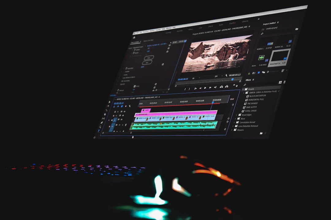
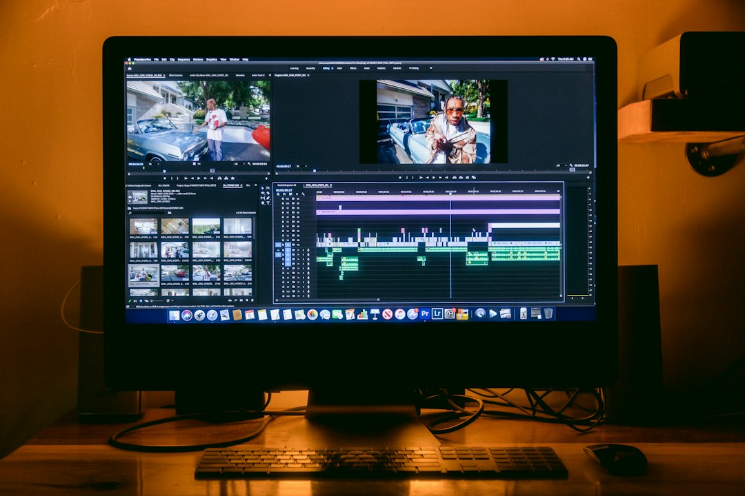
You do not need expensive tools to start. DaVinci Resolve, Premiere Pro, Final Cut Pro, and many other editors offer solid correction controls. What matters most is a repeatable process, a decent monitor, scopes, and a patient eye.
Fix first. Style second. That simple rule solves more color problems than any preset pack. Once exposure, white balance, contrast, and skin tones are under control, creative color becomes easier, cleaner, and far more convincing.