
A SaaS product website is often the first sales conversation a company has with a potential customer. If the page feels slow, confusing, outdated, or misaligned with the product’s value, visitors may leave before booking a demo or starting a trial. A redesign is not only a visual upgrade; it is a strategic process for improving trust, clarity, usability, and conversions.
TLDR: A SaaS website may need a redesign when conversions drop, messaging feels unclear, pages load slowly, or the design no longer reflects the product. Strong redesigns focus on user intent, clearer positioning, better calls to action, and smoother navigation. The goal is not simply to look modern, but to help more visitors understand the product and take the next step.
Why SaaS Website Redesigns Matter
Unlike static corporate websites, SaaS websites must support several conversion paths at once: free trials, demo requests, pricing page visits, newsletter signups, and product education. A visitor may be comparing multiple vendors, researching features, checking integrations, or looking for proof that the platform can solve a specific business problem.
When a website fails to answer those questions quickly, the product may appear less capable than it really is. A thoughtful redesign helps align the website with current customer needs, market expectations, and the company’s growth goals.
1. Conversion Rates Are Declining
The clearest sign that a SaaS website needs attention is a decline in conversions. If trial signups, demo bookings, or pricing page clicks are dropping despite steady traffic, the website may be creating friction.
Common causes include weak calls to action, confusing page layouts, unclear pricing information, or forms that ask for too much too soon. A redesign can help by making the main conversion path more visible, reducing distractions, and placing persuasive content near decision points.
Key metric to review: conversion rate by landing page, traffic source, and user segment.
2. The Messaging No Longer Matches the Product
SaaS products evolve quickly. New features are launched, new use cases appear, and new customer segments become more important. However, many websites continue to describe the product as it existed years earlier.
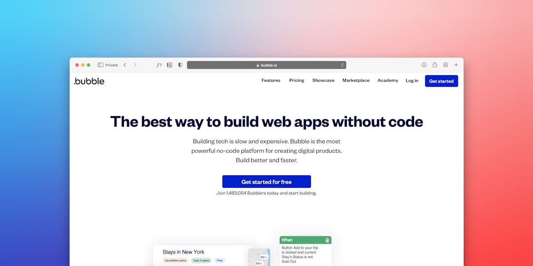
If the homepage headline, feature pages, or product screenshots no longer match the current platform, visitors may misunderstand the value. A redesign gives the company an opportunity to sharpen its positioning, update its value proposition, and speak directly to the most profitable customer profiles.
- Old message: “Project management software for teams.”
- Stronger message: “Workflow automation for operations teams that need faster approvals and fewer manual tasks.”
3. The Website Looks Outdated Compared to Competitors
Design trends should never be followed blindly, but visual credibility matters. If competitors appear cleaner, more polished, and easier to understand, an outdated website can make the SaaS product seem less reliable.
Outdated design may include cluttered layouts, generic stock imagery, inconsistent icons, small typography, or screenshots that no longer reflect the interface. A modern redesign can improve perceived trust and help the product feel more established, especially in competitive categories where buyers compare several options within minutes.
4. Users Struggle to Understand What the Product Does
If visitors need too much time to understand the product, the website is not doing its job. SaaS buyers usually want fast answers to three questions: what the product does, who it is for, and why it is better than alternatives.
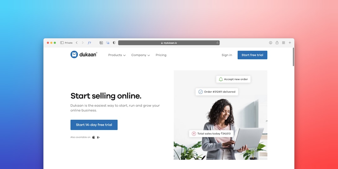
A redesign should make these answers obvious above the fold and reinforce them throughout the page. Clear headlines, concise subtext, product visuals, customer proof, and use case sections can help visitors build confidence quickly.
Helpful redesign approach: replace vague benefit statements with specific outcomes. Instead of saying “work smarter,” the page should explain how the software saves time, reduces costs, improves reporting, or increases team efficiency.
5. Navigation Has Become Too Complicated
As SaaS companies grow, their websites often accumulate too many pages, menus, dropdowns, and resource links. What once felt comprehensive may start to feel overwhelming.
Complicated navigation can prevent visitors from finding pricing, integrations, case studies, or product details. A redesign should simplify the structure and prioritize the paths that matter most. For example, a product-led SaaS company may emphasize “Start Free Trial,” while an enterprise SaaS company may emphasize “Book a Demo.”
- Group related pages under clear menu labels.
- Limit the number of primary navigation items.
- Make pricing, demos, and product pages easy to find.
- Use footer navigation for secondary links.
6. Mobile Experience Is Weak
Even in B2B SaaS, many visitors research products on mobile devices before returning later on desktop. If the mobile experience is slow, cramped, or difficult to navigate, the company may lose early-stage interest.
Mobile redesign improvements may include larger tap targets, shorter forms, simplified menus, faster-loading images, and content blocks that stack cleanly. The goal is to make the website useful at every screen size, not merely responsive in a technical sense.
7. Page Speed and Technical Performance Are Hurting Engagement
A SaaS website can have strong messaging and attractive design but still underperform if it loads too slowly. Heavy scripts, uncompressed images, excessive animations, and bloated page builders can increase bounce rates and reduce conversions.
Performance is also connected to search visibility. Search engines and users both prefer fast, stable pages. A redesign should include technical cleanup, image optimization, improved hosting where necessary, and careful use of third-party scripts.
Important areas to audit: loading speed, mobile performance, Core Web Vitals, broken links, tracking errors, and form functionality.
8. The Website Lacks Social Proof and Conversion Trust Signals
SaaS buyers want evidence before they commit. If a website has limited testimonials, weak case studies, missing security information, or no recognizable customer proof, visitors may hesitate.
A redesign can bring trust signals closer to conversion points. Customer logos, review scores, detailed case studies, security certifications, integration badges, and usage statistics all help reduce perceived risk. For enterprise SaaS, trust content around compliance, onboarding, support, and data protection can be especially important.
What a Successful SaaS Redesign Should Include
A strong SaaS website redesign is built around strategy before visuals. The team should understand the ideal customer profile, key objections, traffic sources, buyer journey stages, and primary conversion goals.
The redesign process often includes:
- Website audit: Review analytics, heatmaps, search data, technical performance, and user behavior.
- Messaging strategy: Clarify positioning, value proposition, use cases, and differentiators.
- Information architecture: Simplify navigation and organize pages around user intent.
- Wireframing: Plan page structure before focusing on visual design.
- Visual design: Create a modern, consistent, conversion-focused interface.
- Development and testing: Build fast, responsive pages and test forms, tracking, and integrations.
- Optimization: Continue improving pages based on analytics and A/B testing.
Common SaaS Redesign Mistakes to Avoid
Some redesigns fail because they focus too heavily on aesthetics and not enough on conversion strategy. A visually impressive website can still underperform if the message is unclear or the user journey is confusing.
- Redesigning without data: Decisions should be supported by analytics, user feedback, and conversion research.
- Removing high-performing content: Existing SEO pages and conversion assets should be reviewed before changes are made.
- Using vague copy: SaaS visitors need specific benefits, not generic claims.
- Ignoring post-launch testing: A redesign should be the beginning of optimization, not the end.
FAQ
How often should a SaaS website be redesigned?
Most SaaS websites benefit from a major review every two to three years, though smaller updates should happen continuously. The timing depends on product changes, market shifts, performance data, and conversion trends.
Is a full redesign always necessary?
No. Sometimes a focused refresh is enough. If the brand, structure, and technology are still strong, improvements to messaging, calls to action, page speed, or landing pages may deliver better results without a complete rebuild.
What pages matter most in a SaaS redesign?
The most important pages usually include the homepage, pricing page, product or feature pages, demo page, trial signup page, comparison pages, and case studies. These pages have the greatest influence on trust and conversions.
How can a SaaS company measure redesign success?
Success can be measured through demo requests, trial signups, lead quality, pricing page visits, bounce rate, engagement time, page speed, organic traffic, and customer acquisition cost. The best metrics depend on the company’s sales model.
Should SEO be part of a SaaS website redesign?
Yes. SEO should be considered from the beginning. Existing rankings, URL structures, metadata, internal links, and high-performing content should be protected so the redesign improves search visibility rather than damaging it.