
Magento is a powerful ecommerce engine. It can run a tiny boutique or a giant online store. But power alone does not sell products. Good design does. A great Magento store feels fast, clear, and easy. It helps shoppers find what they want. Then it gently says, “Go on, add it to the cart.”
TLDR: Magento ecommerce design works best when it is simple, fast, and focused on the shopper. Clear navigation, strong product pages, and a smooth checkout can raise conversions. Performance matters a lot, because slow pages lose sales. Design for real people first, then polish the fancy stuff.
Start with the shopper, not the theme
A pretty theme is nice. A useful store is better. Before you choose colors or sliders, ask simple questions.
- Who is buying from this store?
- What do they need to find fast?
- What worries stop them from buying?
- What device do they use most?
Magento gives you many options. That is great. It can also be dangerous. Too many features can turn your store into a cluttered closet. Keep the layout clean. Keep choices clear. Every page should have one main job.
If the page is a category page, help people browse. If it is a product page, help them decide. If it is checkout, help them finish. Simple. Strong. Smooth.
Make navigation feel like a friendly map
Navigation is not decoration. It is a map. A bad map makes shoppers grumpy. A good map makes them feel smart.
Use clear category names. Avoid cute labels that confuse people. “Summer Glow Picks” may sound fun. But “Skincare” is easier to understand. You can still be playful in banners and copy. Navigation should be plain and helpful.
Use a clean menu. Add search where shoppers can see it. If your catalog is large, use layered navigation. Magento is built well for filters. Let people filter by size, color, price, brand, rating, and availability.
But do not go wild. Too many filters can feel like a spaceship dashboard. Show the useful ones first. Hide the rest if needed.
Design product pages that sell without yelling
Your product page is the star of the show. This is where shoppers ask, “Is this right for me?” Your design should answer fast.
A strong product page needs:
- Clear product photos from several angles.
- A short product title that says what it is.
- A visible price with no mystery.
- A bold add to cart button that is easy to tap.
- Simple product details written for humans.
- Reviews and ratings for trust.
- Shipping and return info near the buying area.
Do not hide key details in tiny tabs. Shoppers should not need a treasure map to find the size chart. Use plain language. Replace long blocks of text with short sections. Use bullets. Make the important stuff easy to scan.
The add to cart button should stand out. It does not need to scream. It just needs contrast. Pick a button color that pops against the page. Use action text like “Add to Cart” or “Buy Now.” Keep it direct.
Keep mobile design at the front
Many shoppers will visit your Magento store on a phone. Some will be on a train. Some will be on a couch. Some will be holding a snack. Make their life easy.
Mobile design needs big tap areas. Tiny buttons are evil. Forms should be short. Menus should open quickly. Images should load fast. Text should be readable without zooming.
Test everything on real phones. Do not only resize your desktop browser. Tap the menu. Try to filter products. Add an item to cart. Go through checkout. If your thumb gets tired, fix the design.
Speed is part of design
A beautiful slow store is still a slow store. And slow stores leak money. Shoppers do not wait with patience and tea. They leave.
Magento can be fast, but it needs care. Performance should be part of the design plan from day one.
Focus on these basics:
- Optimize images. Use the right size and modern formats when possible.
- Use caching. Magento caching can make pages much faster.
- Limit extensions. Every extension can add weight.
- Choose good hosting. Cheap hosting can cost you sales.
- Use a CDN. It helps deliver assets faster around the world.
- Clean up code. Remove scripts you do not need.
Designers and developers should work together here. A giant homepage video may look cool. It may also slow the store like a sleepy turtle. Use effects with purpose. If an element does not help users or sales, question it.
Make checkout boring in the best way
Checkout is not the place for surprises. It should be calm. Clear. Fast. Almost boring.
Magento checkout should ask only for what is needed. Use guest checkout. Not everyone wants an account before buying. You can invite them to create one after the order. That feels nicer.
Show progress. Show costs early. Shipping, taxes, and fees should not jump out at the end like a villain. Surprise costs are a major reason people abandon carts.
Use trust signals near checkout. Add secure payment icons. Show return policy links. Add customer support info. These small details reduce worry.
Use trust like seasoning
Trust matters. But do not dump it everywhere like glitter. Add it where it helps.
Good trust builders include:
- Real customer reviews.
- Clear return policies.
- Secure payment badges.
- Contact information.
- Delivery estimates.
- Photos from real customers.
Keep the tone honest. Do not use fake urgency all over the store. “Only 1 left!” should be true. Shoppers are smart. They can smell tricks.
Personalize without being creepy
Magento can support smart personalization. This can help conversions. Show related products. Recommend items based on browsing. Remind shoppers of recently viewed products.
But keep it helpful. Not weird. A good recommendation feels like a friendly shop assistant. A bad one feels like someone watching through the window.
Use labels like “You may also like” or “Pairs well with”. Keep the design light. Do not bury the main product under endless carousels.

Design for search engines too
UX and SEO are friends. They both like clear structure. Magento stores should have clean category pages, useful product descriptions, and fast load times.
Use proper headings. Write unique product copy when you can. Add alt text to images. Make URLs readable. Avoid duplicate content problems where possible.
Also, design landing pages with intent. A shopper searching for “black leather backpack” should land on a page that matches that need. Do not make them dig through 500 bags. That is not fun. That is homework.
Measure, test, and improve
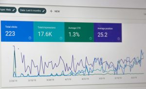
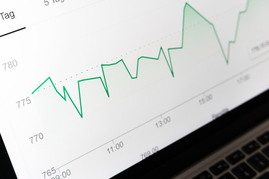
Even smart people guess wrong. That is why testing matters. Watch how users move through your Magento store. Look at bounce rates, cart abandonment, search terms, and conversion rates.
Run A/B tests when possible. Test button text. Test product photo layouts. Test checkout steps. Small changes can bring big wins.
Also talk to customers. Ask what confused them. Ask what almost stopped them from buying. Their answers are gold. Sometimes the fix is tiny. Maybe the size guide is hidden. Maybe shipping info is unclear. Maybe the coupon box is causing doubt.
Final thought
Great Magento ecommerce design is not about flashy tricks. It is about making shopping feel easy. Understand how to map ecommerce roles to business functions. Guide people. Build trust. Load fast. Keep checkout smooth. Make the next step obvious.
When UX, performance, and conversion design work together, your store becomes more than a website. It becomes a helpful little sales machine. And that is the kind of magic every Magento store deserves.